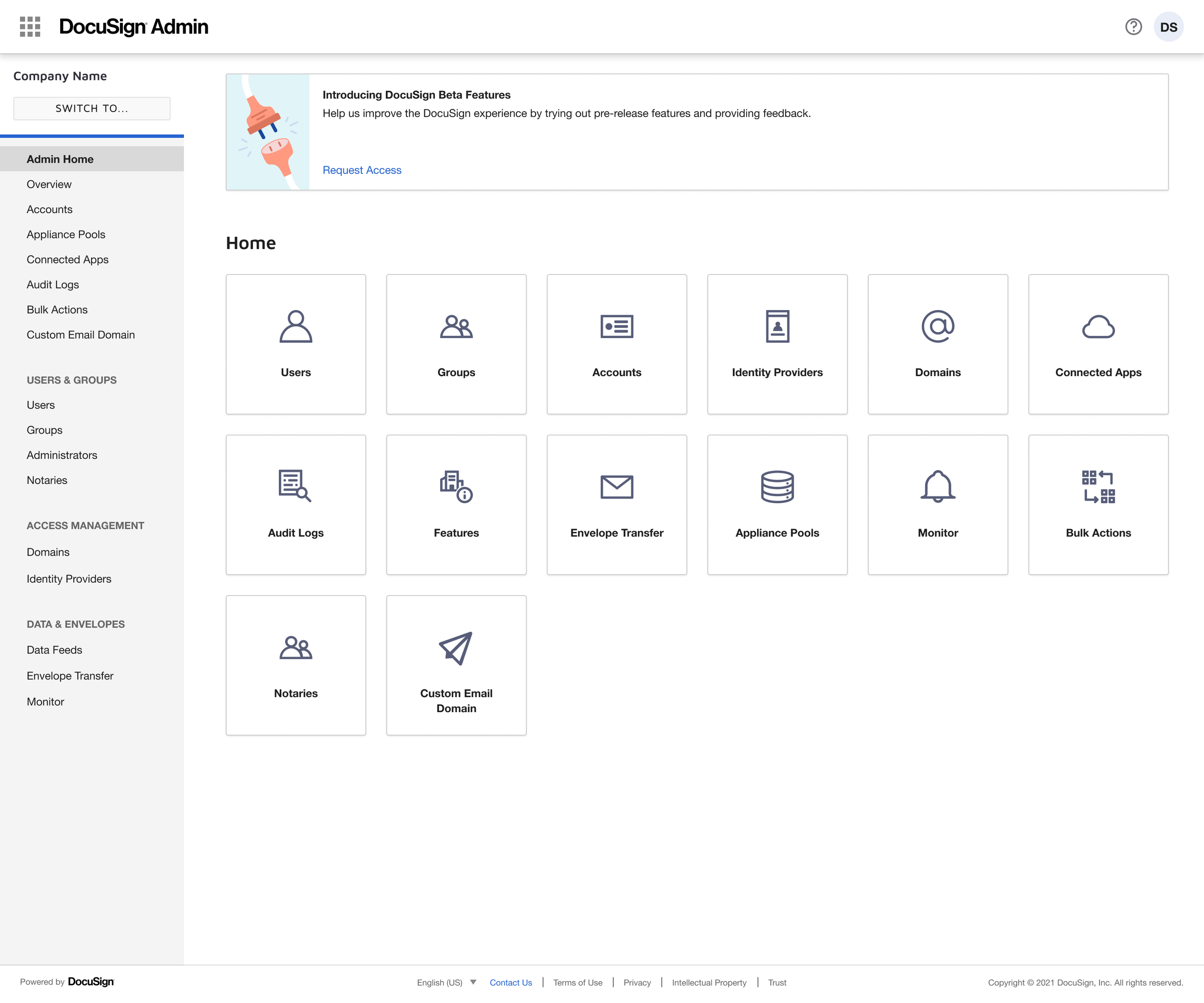
DocuSign Admin home page revamped
Problem statement
Note: this project was one of the projects originated from DocuSign Admin Pain Points.
During the interviews with internal stakeholders, we learned that customers had no guidance in the product, and many of them - especially the ones who did not pay for dedicated support - would not even get past the configuration phase. We had to improve our onboarding process, and implement features to provide awareness in the product in the various steps of creating and setting up an organizations.
Opportunity
After brainstorming sessions with the UX Design team, we decided to redesign the DocuSign Admin home page. Why the Homepage?
It served as the starting point for new and existing admins
The existing version lacked guidance or support content
It was a cost-effective, light-touch solution with measurable impact
By providing information and guidance to users, we could greatly reduce or eliminate many of the pain points surfaced by the interviews
Business goal
Provide awareness to customers and help them throughout the process of creating and setting up an organization by showing them relevant information about the benefits of creating an organization or being linked to an organization, and how to set up a healthy organization:
Specifically, enhance the DocuSign Admin homepage with visually-appealing content, features, and services that empower administrators to be successful.
Project details
Initially, the DocuSign home page would show a collection of tiles representing a subset of menu items in the left sidebar navigation. The number of tiles could range between 8 and 14 depending on the customer's plan. The tiles were represented in a standard grid format and included the name of the page, simple icons, and clickable links that would lead to the same destinations found in the sidebar.
I had a couple of brainstorm sessions with the Design team during which we decided that the following elements would be added to the new home page:
Header with greeting text
Improved tile options with relevant information such as: number of accounts, number of administrators, number of domains claimed
Spotlight cards with top tasks based on metrics around what users would click the most in the existing home page
Useful links to support articles, trainings, etc
Final considerations
The new home page provided opportunity to instrument actions for administrators to take that are correlated with retention.
The first action instrumented was a warning to add a backup admin for organizations with one single admin. Once the new home page was released, we noticed an immediate spike initially as high as 114% in adding a backup admin.
Future releases include making the home page smarter by customizing its tiles, spotlight cards and links to support articles and trainings based on the permission owned by the administrator logged-in.

